If you’ve lived in your home for a while, it can sometimes get a little boring having the same furniture and features that you’ve had for years. With general wear and tear, there are improvements that you might look to make when you have the budget and time to do it. So with that in mind, here are six improvements to make to your home:
Reinvent A Room:
Depending on how many rooms are in your property, you may have one or two spaces that are empty or are currently a storage space for extra bits and pieces that don’t have a home. This might be a great opportunity to reinvent a room and turn it into something that could be useful. When clearing out the room, try to declutter as much as possible. Then, look at the size of the space and figure out what might work well. Perhaps a walk in wardrobe or maybe a mini cinema room!
Improve Outdoor Space:
Outdoor space, unless you consider yourself a keen gardener, will often get ignored. It might be that the garden is too high maintenance or you’ve not invested any time or attention into doing it up. No one wants to spend their time in a space that might be messy or ugly to look at. So if you’re looking for ideas to improve your outdoor space, here are a few suggestions:
Be Bold With Color – When it comes to your garden, you can go crazy with color. The brighter the colors, the more appealing the space will look to you and your guests. Also, having a variety of plants and flowers will attract more wildlife.
Install A Pond – A pond is another feature that attracts wildlife and it also feels like you’re giving your outdoor area some extra luxury. When making a pond, make sure to dig the right size and in an area that is easily visible. Make sure the base of the pond and the sides are well sealed before filling it in with water. Add a variety of fish friends, too!
Add Levels And Different Materials – Adding levels and using different materials is what gives your garden space that wow factor. It’ll make your guests think that you’ve really put some effort into the space. Think about using more than just grass, perhaps marble, stones, and bark. Add decking for levels and hire patios builders to help with the more complex work.
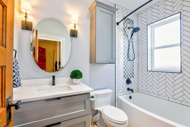
Update Your Bathroom:
The bathroom can end up becoming a little dated, especially if you haven’t done anything since you moved. If you can’t renovate the bathroom fully, then start with the smaller items and work your way up. Tiling and painting can help dramatically transform it and adding new taps, a more modern toilet, and a rainfall shower can be the slightly bigger buys later on down the line. Make sure that the room is well ventilated and that you accessorize it with soft furnishings that match the theme of your bathroom.
Rearrange The Furniture:
Improvements don’t need to cost a thing, you can simply rearrange the furniture. When you first moved into your property, you will have likely put everything where you first thought it could go. Now is an opportunity to change up the space a little and rearranging the furniture can make a big improvement without spending any money. Start on each room individually and try changing the position of the biggest piece of furniture. If that’s not possible, then look at moving the smaller pieces of furniture and seeing if that makes any difference. To finish it off, replace or update your soft furnishings, and it’ll feel like stepping into a new room.
Renovate Your Kitchen:
Kitchen renovations are sometimes necessary as it’s one of the most used places in your home. Therefore, the wear and tear will be clear on most of your appliances, particularly your everyday essentials like the kettle and oven. Kitchen cabinets are also the first things to fall off their hinges. Kitchen renovations are expensive but well worth the investment. It might also be financially beneficial to get it done if it needs doing as it can add value to your property if you sell it at any point in the future. Even if you start with replacing or painting the cabinets, that’ll make a difference. To begin your kitchen renovation, simply enter a search for “Queens kitchen renovations” (or your local area). The professionals you choose will be able to work with your vision while using their own expertise for an end result that is both functional and aesthetically pleasing.
Insulate Your Property:
Insulation is important to your property, especially during the colder months. Overall, it helps to keep the heat in and the cold out. This can also save you a lot of money further down the line as you’re likely to save on energy because of it. So, to insulate your property, make sure your windows are either double or triple glazed. Insulate them with heavier blinds or curtains. Darker colors are going to attract sunlight which should, in turn, make your rooms a lot warmer. Insulation doesn’t need to be expensive as there’s a range of materials that are available at different costs. Try insulating your walls if possible and the loft space. If you have the DIY skills, you can always try it yourself, but it might be handy getting in a professional to do it.
Adding improvements to your home can help your space feel brand new, like when you first moved in. Change things up and see the difference for yourself!
Featured Image By: Pexels